

Change the appearance or content of a chart
You can use charts to explore your project or present your findings. This topic describes how to change the chart type or the data that is displayed.
What do you want to do?
- Change the items displayed on a chart
- Change the chart type
- Zoom in or out of a 3D chart
- Rotate a 3D chart
- Display item colors on a chart
- Show or hide gridlines on a chart
- Change or format the chart title
- Show, hide or change the position of the chart legend
- Display data values on a chart
- Change or format the axis labels
Change the items displayed on a chart
-
On the Chart tab, in the Options group, click Select Data.

The Chart Options dialog box opens.
-
Under Chart items, click Select, and then add or remove items using the Select Project Items dialog box.
-
(Optional) Change the default chart options:
-
You can change what is displayed on the chart axes.
-
For charts showing attribute values, you can modify the order of the attributes.
-
Click OK.
NOTE
-
For charts of Twitter datasets, change the items displayed on the chart by selecting different options for the X, Y, and Z axes in the Chart Options dialog box. (NVivo Pro and Plus only)
-
For charts of matrix coding query results, you need to change the cell content in the node matrix in order to change the chart—click the Node Matrix tab in Detail View to display the node matrix, then click Node Matrix in the Detail View group on the View tab. (NVivo Pro and Plus only)

Change the chart type
You can change the chart type to give the chart a different look or make it easier to interpret—for example, change a column chart to a pie chart.
-
On the Chart tab, in the Type group, click the chart type that you want.
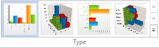
NOTE To see all the
available chart types, click More  . Only
the chart types that are relevant to the data in your chart will be shown.
. Only
the chart types that are relevant to the data in your chart will be shown.
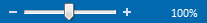
Zoom in or out of a 3D chart
To quickly zoom in or out:
-
On the Status bar, click the Zoom slider.
-
Slide to the percentage zoom setting that you want.
To choose a particular zoom setting:
-
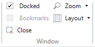
On the View tab, in the Window group, click Zoom, and then select the required zoom level.
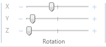
Rotate a 3D chart
-
On the Chart tab, in the Rotation group, move the X, Y, or Z sliders to rotate the chart.
Shortcut You can also click and drag your mouse on the image to rotate the 3D chart.
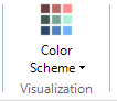
Display item colors on a chart
If you have assigned colors to sources, nodes, or attribute values, you can display the item colors on the chart—items with no color are displayed in white.
-
On the View tab, in the Visualization group, click Color Scheme, and then click Item Colors.
NOTE You can set the application options to display user assigned item colors by default when you create a chart—refer to Set colors for more information.
Show or hide gridlines on a chart
You can show gridlines on your chart to make it easier to read.
To show or hide major or minor gridlines:
- On the Chart tab, in the Gridlines group, click X, Y or Z.
Change or format the chart title
To modify the title:
-
On the Chart tab, in the Labels group, click Edit Labels.
-
Modify the Title.
-
Click OK.
NOTE To hide the title, clear the Include Title check box.
To format the title:
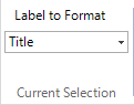
-
On the Chart tab, in the Current Selection group, in the Label to Format list, select Title.
-
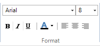
On the Chart tab, in the Format group, select the options you want for Font, Font Size, Bold, Italic, Underline, or Font Color.
To change the position of the title:
-
On the Chart tab, in the Current Selection group, in the Label to Format list, select Title.
-
On the Chart tab, in the Format group, click Align Text Left, Center, or Align Text Right.
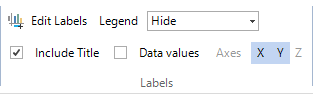
Show, hide or change the position of the chart legend
You can show, hide or change the position of the chart legend.
-
On the Chart tab, in the Labels group, do the following:
-
To position the legend, click Right, Left, Top or Bottom in the Legend box.
-
To hide the legend, click Hide in the Legend box.
Display data values on a chart
You can display data values on 2D column or bar charts.
- On the Chart tab, in the Labels group, select the Data values check box.
Change or format the axis labels
To modify the axis labels:
-
On the Chart tab, in the Labels group, click Edit Labels.
-
Modify the X-Axis, Y-Axis or Z-Axis label text.
-
Click OK.
NOTE To show or hide the axis labels, click X, Y or Z in the Labels group on the Chart tab.
To format the axes labels:
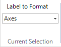
-
On the Chart tab, in the Current Selection group, in the Label to Format list, select Axes.
-
On the Chart tab, in the Format group, select the options you want for Font, Font Size, Bold, Italic, Underline, or Font Color.